Transforming Item Photography
EBTH Tripod
Summary
As part of a team at EBTH, a company that specializes in online estate sales, I designed a solution to streamline and improve the photography step of item processing.
Through continuous user research and testing, I iterated on user flows and refined product designs to deliver highly targeted task optimizations. With this combination of software and hardware, we were able to increase photographer efficiency and accuracy by up to 50%.
engaging NFL Fans in the off-season
PFF Mock Draft Simulator
Summary
As part of the PFF team, I enhanced the Mock Draft Simulator into a dynamic and engaging user experience that addressed the challenge of decreased site engagement during the off-season.
From a rudimentary prototype, I transformed it into a fully-featured product that quickly became one of PFF’s most popular offerings, both during and outside of the football season. Its success was so significant that the NFL even partnered with PFF to create a version of the Mock Draft Simulator for use on NFL.com.
Getting the details right
EBTH Attribution
Summary
As a member of the EBTH team responsible for internal product design, I created a user-friendly solution for EBTH Attributors to record an item’s measurements, materials, and other basic attributes.
By conducting user testing and continuously iterating the design, we were able to improve the efficiency of item attribution by approximately 25%.
For entertainment purposes only
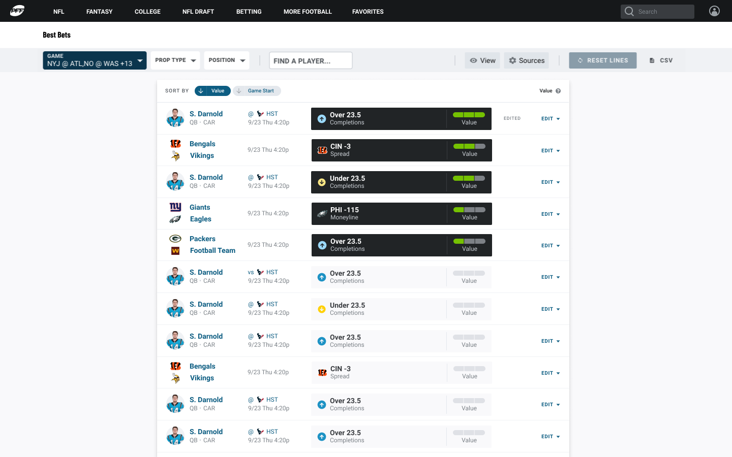
PFF Best Bets

Summary
As a key member of the consumer-facing product team at PFF, I designed Best Bets - a product that engaged sports bettors of all levels. With a deep understanding of user needs and behavior garnered through extensive research and testing, I crafted a solution that catered to beginners just starting out in sports betting, as well as seasoned bettors.
The updated version of Best Bets resulted in a significant increase of approximately 20% in user engagement compared to the previous version.
Campaign from any device
GetThru Responsive Caller
Summary
As a UX consultant for GetThru, I undertook a challenging project to optimize their dialing platform for mobile use. To achieve this, I conducted a comprehensive restructuring of the product’s information hierarchy and layout, which was originally designed solely for desktop use.
As a result of this redesign, the product’s user base increased by a significant margin, reaching approximately double the number of users. Additionally, the structural groundwork I laid down paved the way for faster and more efficient adaptations of other GetThru products to become mobile-friendly, resulting in a 50% reduction in time and effort.